Thursday, December 16, 2010

Tuesday, December 14, 2010


Monday, December 6, 2010


Friday, November 5, 2010


Wednesday, November 3, 2010
Rule of Thirds Quiz; Nov. 3/ 2010
In the first picture, the third picture and fourth image is a good demonstration of rule of thirds. Rule of thirds is when a picture shows more than one composition and two points of interest, making the eye have to focus on more than one spot on the image. Rule of thirds can also incorperate movement, leading lines, center of attention and balance.
The first picture the photographer shows good rule of third because the person who is standing on the posts is off-centered that is going through the top left and bottom left intersect. In the backround, you can see that the barn is to the right of the person, and draws attention in the middle-right intersect.
The third picture shows rule of thirds and movement. There are two main parts to the photo; the person that goes through the top and bottom left intersects, and the flying bird that is in the top right intersect, along with the people far in the distance through the entire picture.
The fouth picture also demonstrates a rule of thirds understanding and leading lines, because looking up from the ground to the sky and the tower, you find that the top of the tower draws your eye to the top right intersect of the photograph, which is also where all the lines from the tower meet in the middle. In the top of the picture you see the blue sky and clouds, which compliments the image.
Monday, November 1, 2010


Thursday, October 21, 2010
Photoshop makeover; Oct. 19/ 2010
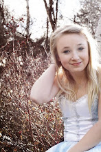
 In this assignment Alyssa was photographed infront of a blank board backround using natural lighting and basic photoshop protocol editing. After using levels, colour balance, contrast, sharpening tool and channel mixer, adjustments were made with the lighting after turning the picture to a monotone and created a duplicated layer. On that duplicated layer the surface blur tool was used to make her skin looked softer, then her eyes, hair, mouth, nostrils and eyebrows to make the picture still look realistic. To finish it, the dodge tool was used to create a dramatic backround so that Alyssa was the main attention on the picture.
Friday, October 8, 2010
Fall Light; Oct. 8/ 2010
 This assignment is aiming to get an " A criteria ". The purpose of the placement of shot was to get the long casted shadows that come out mid-afternoon, the picture was also taken off-centered to Jesse so that it would be considered a Rule of thirds spot and so that there was leading lines directed towards him on the path and throughout the grass. To get the colours and shading in the picture the basic protocols were used. First, levels, colour correction, then contrast, crop, sharpen and useage of the dodge and burn tool in a seperate layer to create a more dramatic, darker lighting in the afternoon forest walk.
Wednesday, October 6, 2010
Rule of Thirds; Oct. 6/ 2010

In this assignment we learned how to use rule of thirds. Rule of thirds makes a picture have more than one composition and two points of intrest, making the eye have a focus on more than one thing at a time.
Tuesday, September 21, 2010
Layers Correction; Sept. 19/2010

This assignment was about using layers to create a more dramatic picture, without the fake colours that come into the picture during the editing process. Using the dodge and burn tool emphasizes some parts of the picture and make others less noticable and more bright, for example, brightening the lower half of the picture to draw more attention to the dark mountains and sky.
Friday, September 17, 2010
Leading Lines; Sept. 17/2010


This assingment was an example of using leading lines, to indicate to the viewer that the lines are contrasted into the main focus of the picture, which is the person with the red circle over them.
Wednesday, September 15, 2010
Duotone- Quickmask ; Sept. 9/2010
.jpg)

This assignment was an example of using the quick mask mode tool. The reason why quick mask mode was used is to help clear attention to the foreground. This is done by softening the background to draw the attention towards the foreground, and the part of the picture most ideal for visualizing. The duotone colour was also edited into the image to create a better mood and a warmer picture than just black and white.
Subscribe to:
Posts (Atom)